A high-impact rebranding initiative to reintroduce the legacy GGP brand, marking a deliberate shift away from the Brookfield Properties name and brand, and restoring GGP’s heritage as a leader in premier retail real estate.
Strategic & Creative Lead
Crafting the Next Chapter of Retail Real Estate
GGP needed more than a new logo; it needed a new narrative. The challenge was to evolve a legacy brand into one that felt modern, insightful, and ready for the future of retail, without losing the foundation of trust and expertise it was built on. We were tasked with a complete corporate rebranding—from visual identity and brand voice to the full spectrum of internal and external brand applications.
The Challenge:
Reintroducing GGP—from Brookfield Properties back to our roots
Reintroducing GGP—from Brookfield Properties back to our roots
After several impactful years under the Brookfield Properties name, the decision to reintroduce the legacy GGP brand was both bold and deeply strategic. This wasn’t just a change of signage—it was a return to our heritage as one of retail real estate’s true pioneers. Although GGP was widely respected, the shift away from our original name had created distance from the rich legacy and local equity the brand had built over decades.
The challenge lay in rekindling that authentic connection: how do you bring back an iconic brand, with all its name recognition and emotional resonance, while ensuring it reflects a modern, forward-thinking identity? The answer required more than nostalgia. We needed a revitalized identity that could inspire confidence in sophisticated financial partners, energize leasing teams, win over top-tier retailers, and reignite internal pride—without feeling dated or losing the progress made as part of Brookfield. GGP had to become both a bridge to our storied past and a signal of a fresh, exciting future for the company and its communities.
The Solution:
A brand built on insight and wit
A brand built on insight and wit
We developed a brand strategy and visual system rooted in the core idea of GGP as a curator of premier retail experiences. This was not just about owning properties; it was about shaping environments.
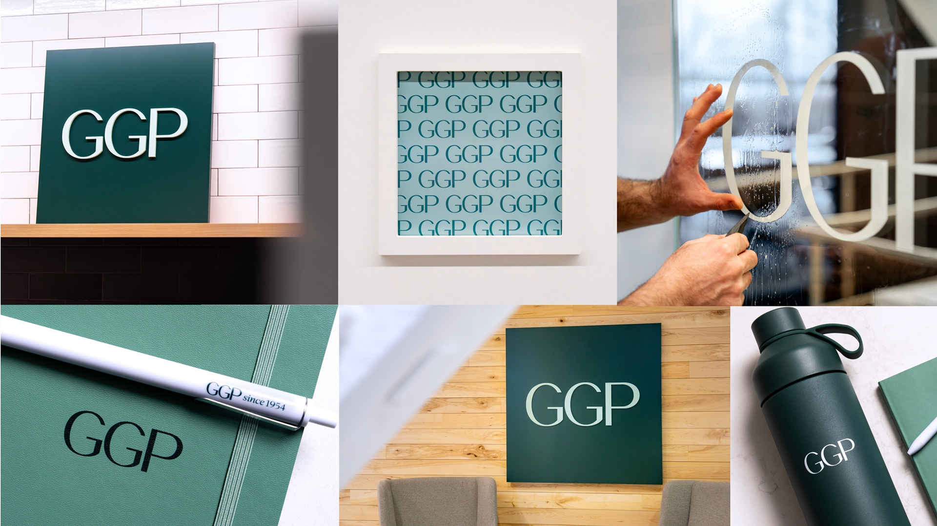

A New Voice & Visual Identity: We established a tone that is 75% Sage and 25% Jester—knowledgeable and insightful, with a witty, approachable edge. The visual identity reflects this duality. The new logo is clean, modern, and built on a foundation of strong geometry, communicating stability and clarity. Its dynamic motion graphics, however, reveal a playful and adaptive personality.
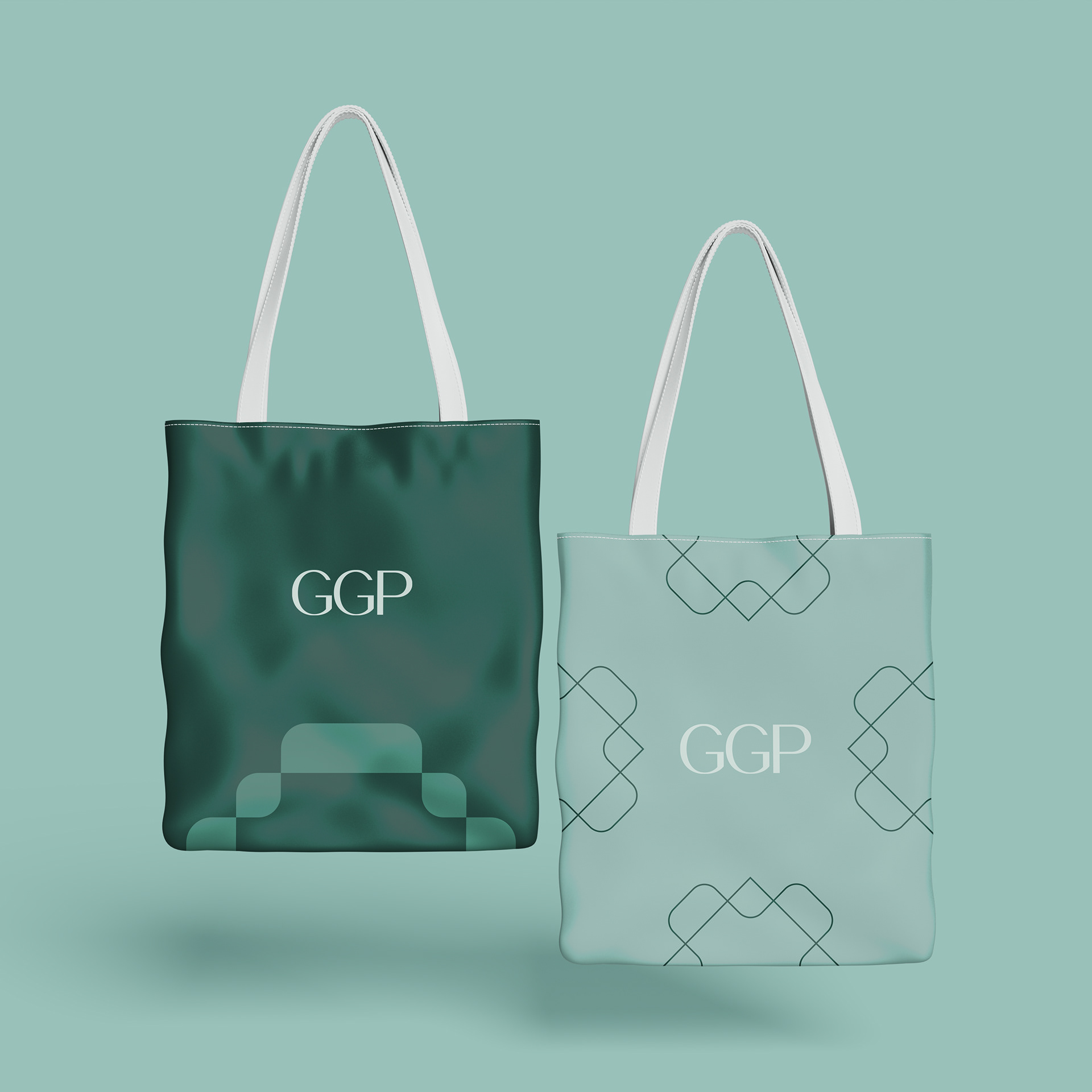
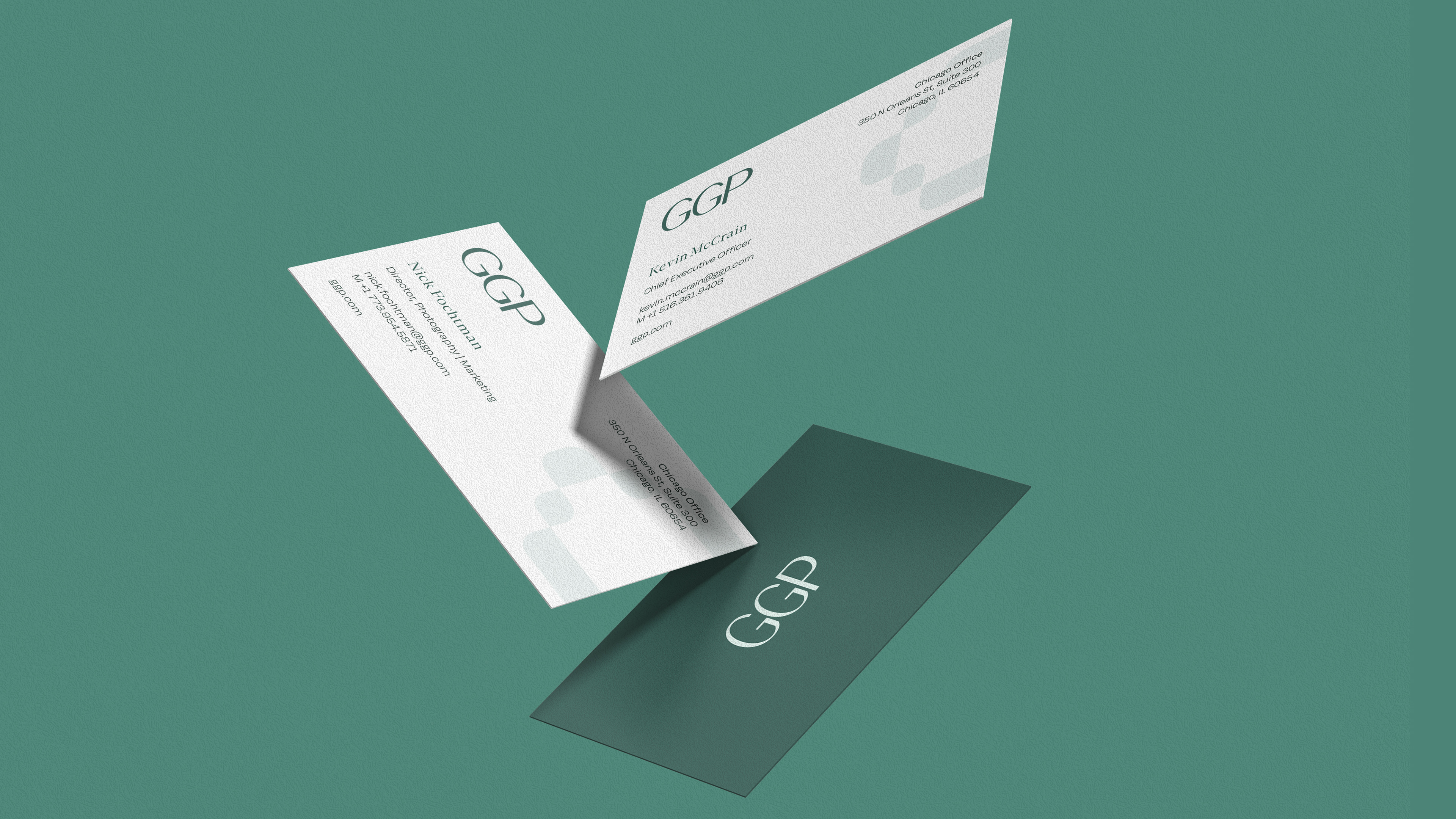
A System Designed to Flex: The rebranding extended far beyond the logo. We created a comprehensive system of assets designed to bring the brand to life across every touchpoint:
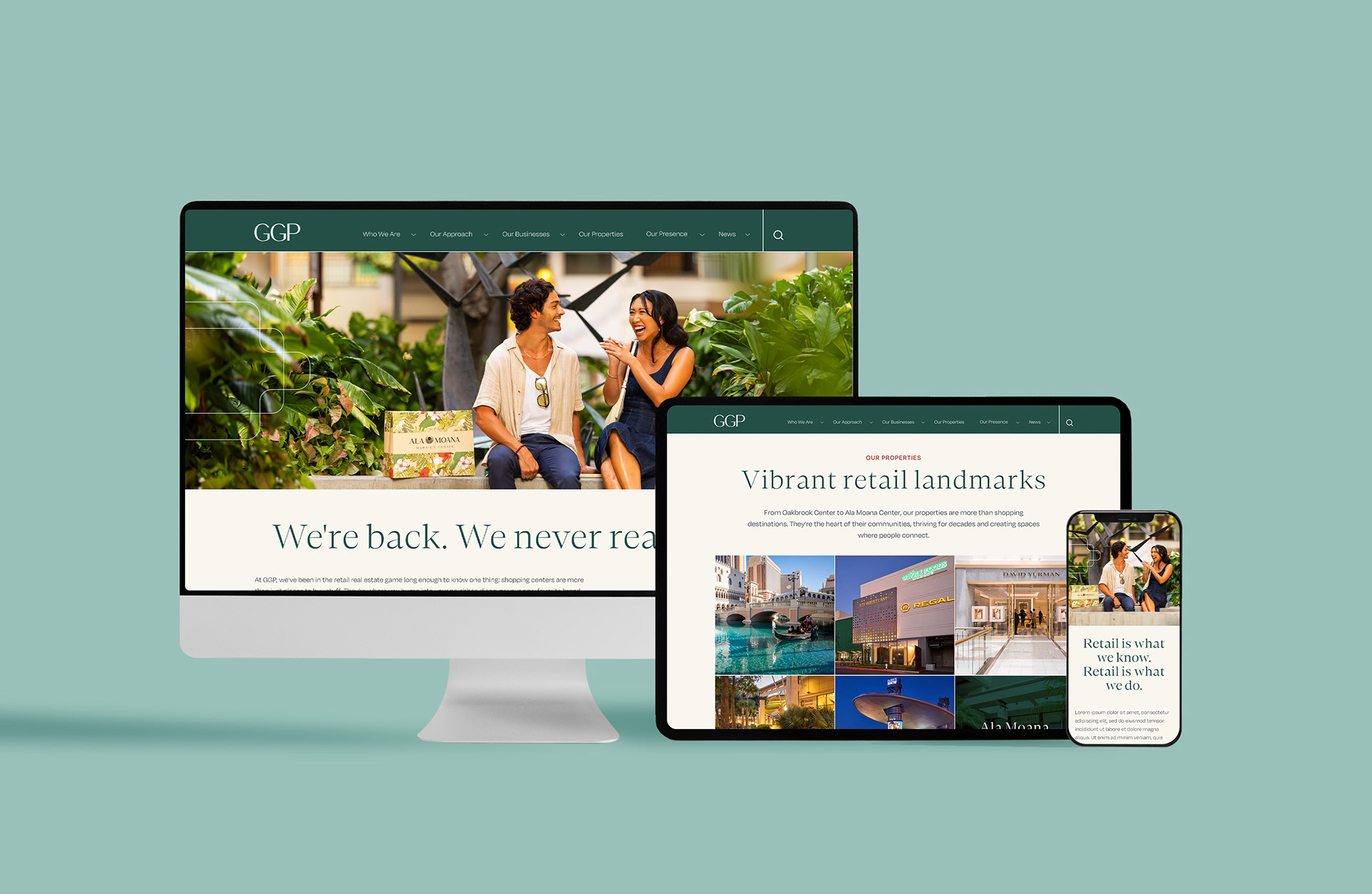
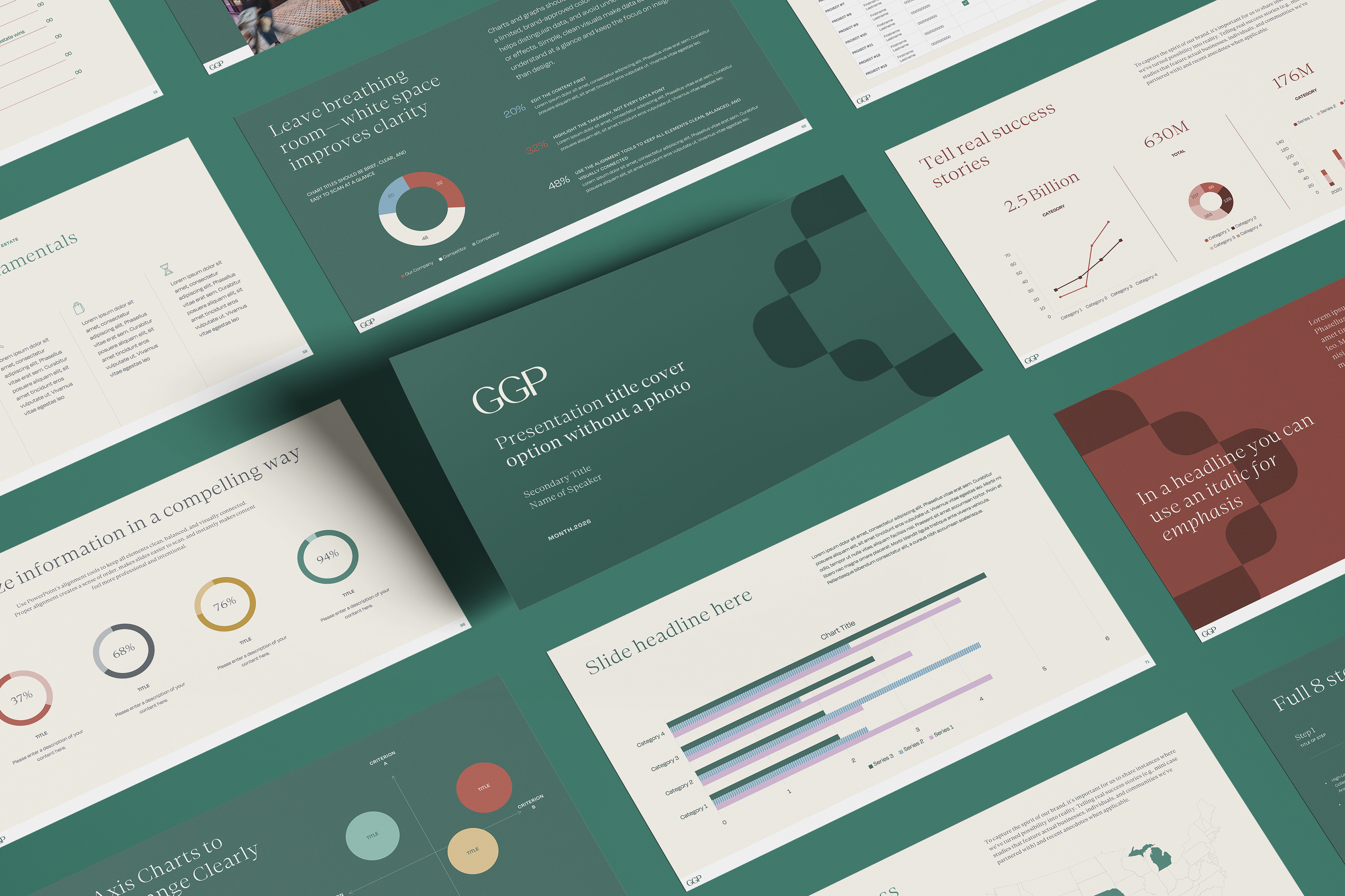
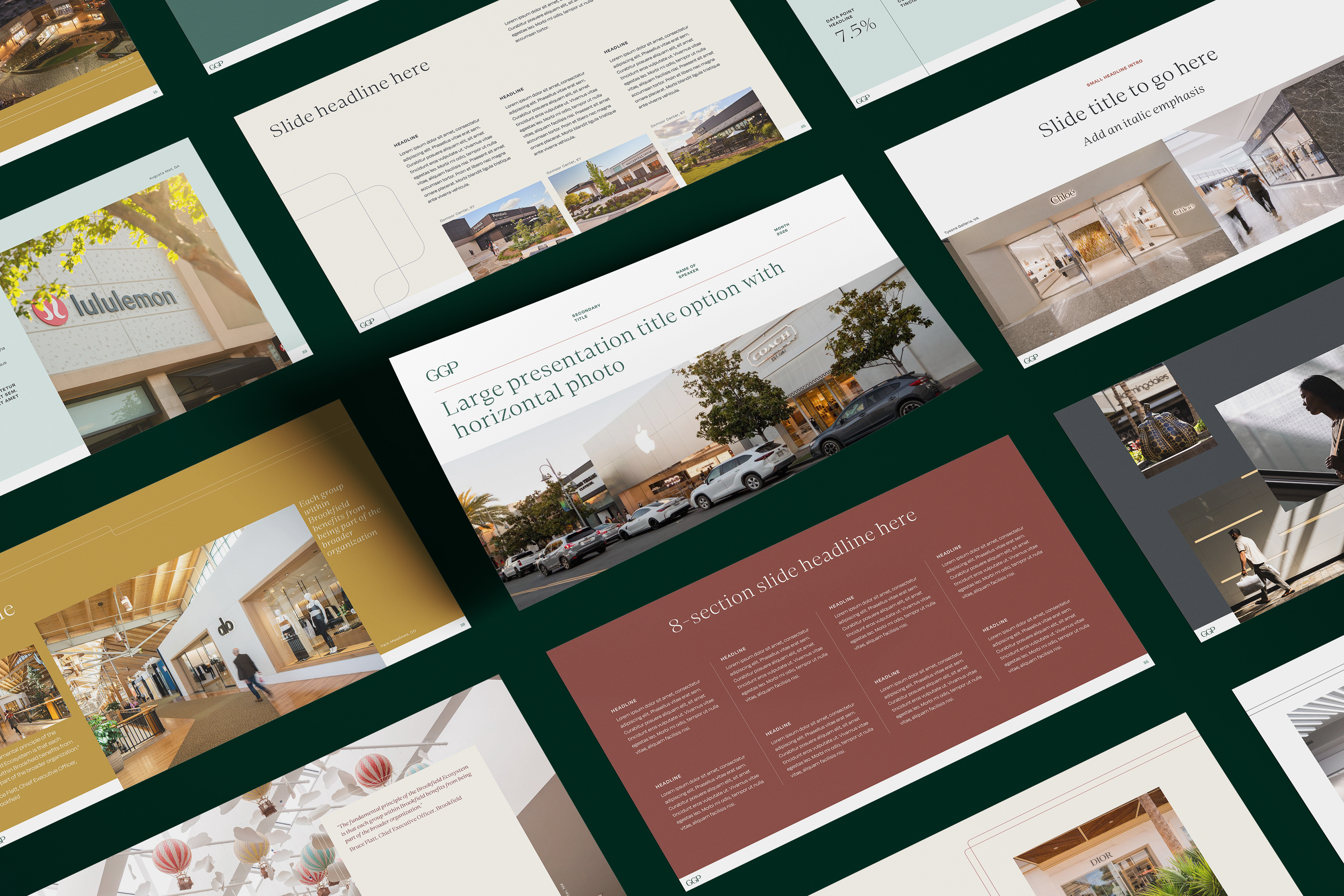
Digital Presence: A complete redesign of GGP.com to be more intuitive, visually engaging, and content-rich, along with new presentation templates that empower the team to tell the brand story consistently.
Physical Spaces & Swag: We transformed the office environment with bold entrance branding. To foster employee pride, we developed a line of thoughtfully designed swag—from umbrellas and tote bags to notebooks and water bottles—that people would actually want to use.
Brand Launch: The new brand was introduced through a powerful launch video, communicating our renewed vision and celebrating the legacy that brought us here. This set the stage for the internal and external rollout, ensuring the entire organization felt part of this new chapter.
The Result:
A rebrand with a clear vision
A rebrand with a clear vision
The result is a cohesive and compelling brand identity that positions GGP for its next era of growth. The new brand is confident, clear, and imbued with a personality that reflects its status as an industry leader. It successfully bridges the gap between a storied legacy and a bright, innovative future, proving that a corporate brand can be both incredibly smart and refreshingly human. The new GGP is not just a name; it’s a point of view.